Template:Hover
The Hover template is for creating text which, when hovered over with the mouse, pops up additional text or an image. The text which should be hovered over is given first as an unnamed parameter. Then you pass either the parameter "text" with the desired popup text or "image" with the name of an image (no "[[Image:__]]" wrapper, just the file name). You cannot use both parameters.
You have the following additional options for both text and image popups:
- "padding" (specify the units, e.g. "3px") determines the inset margin of the box's content (default: 5px)
- "bgcolor" sets the background color (e.g. "#0C0C0C" or "purple"); when used with an image popup, this creates a frame around the image with a width set by "padding" (default: white)
- "width" (with the unit, e.g. "50px") will determine the width of the box within which your popup text will be wrapped; if displaying an image, it will be scaled proportionally to fit the given width (default: 150px for text, image's width for image)
- "secret=yes" will avoid the underlining that indicates the presence of a hover text/image
You have the following additional option if providing a text popup:
- "align" will set the alignment of the text (default: center)
You have the following additional option if providing an image popup:
- You can add a "link" parameter and the image will be clickable, leading to the page of your choice
Samples:
{{Hover|Blam!|text=Blam, Oni crashed|bgcolor=#ede9d8}}
yields
Blam!Blam, Oni crashed
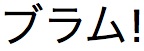
{{Hover|Blame!|image=Buramu!.jpg|bgcolor=red|padding=2px|link=Blame|secret=yes}}
yields
Blame!