User:Paradox-01/Colors: Difference between revisions
m (wording) |
Paradox-01 (talk | contribs) mNo edit summary |
||
| Line 92: | Line 92: | ||
suit | suit | ||
|} | |} | ||
==Style== | |||
<span style="float:left;">https://paradox.oni2.net/wiki/rs/summary/character/konoko/Door_poster_modernized_mockup_2024_1_small.jpg</span> | |||
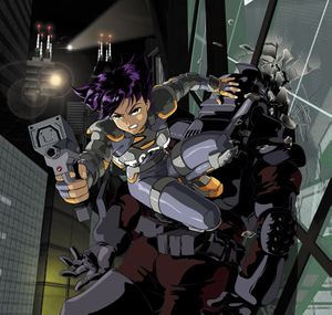
Apropos references, I was lately annoyed by the outdated look of the original works. After more than 20 years it would be time for an update. | |||
More soft lights and shadows would give the images more depth. Here is a photo montage with additional tweaks as an example. | |||
[[Category:Konoko]] | [[Category:Konoko]] | ||
Latest revision as of 22:27, 28 April 2024
KON
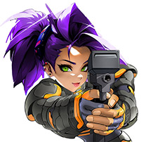
Standardized colors for Konoko's TCTF outfit. The hair colors were tweaked from a lighter reddish to a darker lilac to give a better match with the rest of the images: fly-in heads, Sliding Konoko, Konoko vs. Striker (Uppercut), splash screens, ...
The brownish color from weapon's backside and where the bullets come from have been replaced to reduce the overall color amount and making it more canonical: See Konoko vs. Elite for a better depiction of the TCTF autopistol, it's even more detailed and should be used to replace the one in "Oni door poster".
A table is probably not the best idea for this. Throwing all squares into a svg might be better.
|
hair |
|
eyes, tooth |
|
skin |
|
lips |
|
nails (one of the skin tones is the same as a nails tone in shadows) |
|
w1 top |
|
w1 main |
|
w1 clip |
|
w1 front |
|
armor orange |
|
armor gray |
|
suit |
Style

Apropos references, I was lately annoyed by the outdated look of the original works. After more than 20 years it would be time for an update.
More soft lights and shadows would give the images more depth. Here is a photo montage with additional tweaks as an example.

