Fully Armed Konoko
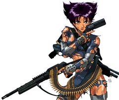
| TORN SUIT KONOKO |
| ⇩ |
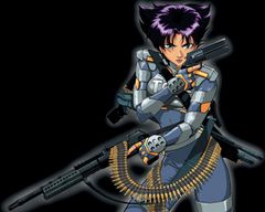
| FULLY ARMED KONOKO V1 |
| ⇩ |
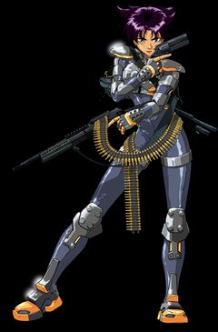
| FULLY ARMED KONOKO V2 |
During Oni's development, Lorraine Reyes drew a piece known by fans by various names such as Torn Suit Konoko, though she later expressed regret in depicting Konoko in a more sexual way than she wanted the character to be seen. When Take-Two took ownership of the property and was going to advertise the finished product as well as design the box art, they too apparently wished for a less revealing rendition of Konoko for use in packaging and in public spaces such as game stores frequented by kids. It was then that Jacen Burrows was brought in to redraw Konoko with an intact bodysuit and armor.[1][2] The resulting piece (see V1, right) was used as the official box art for most of the game's releases, as seen HERE.
The story differs after this point depending on whose recollection we follow. Burrows remembers being asked, after covering up Konoko's torso, to add the rest of Konoko's figure to the image (V2, right); Take-Two apparently wanted a full-body shot of Konoko for use as a cardboard standup that could advertise the game in stores.[2] (Another piece of art was commissioned from Burrows for a second standup where Konoko did not carry any guns and was simply posed in a fighting stance, making it kid-safe enough to display in stores like Toys "R" Us. This piece is closer to Burrows' own style and is unrelated to the art discussed here.) However Lorraine recalls drawing the full-body version of the cover art herself.[3] Whoever drew it, it's interesting to note the changes that were made to Konoko's armor by the artist.
Armor analysis
At a glance, the Konoko in V1 and V2 may look the same, but there are many small differences:
- In V1, the wrist guards retain the design of Lorraine's original, and more generally Konoko's armor in the box art follows the "Mark VI" iteration – the armor that Konoko wears in Oni's earlier promo art, as opposed to the one worn in-game and in artwork from the final promotion cycle – and V2 conforms to the more recent "Mark VII" design.
- Certain elements like her trigger finger and the shotgun on her back are positioned slightly differently.
- Konoko's uniform in V1 has fewer details than V2 when it comes to highlights and armor damage. In fact, V1's armor is untarnished, whereas the V2 armor shows damage that's consistent with the few pieces of armor visible in Lorraine's original art.
- Perhaps fittingly in line with the amount of damage to her armor, V2's Konoko has the same stern expression as in Lorraine's original, whereas in V1 she sports a self-assured smile, enhanced with lipstick no less.
Either Burrows used this second take on Fully Armed Konoko as an opportunity to bring Konoko's appearance in line with Lorraine's latest promotional art or else the changes are due to the original artist taking over once again. The resolution of the V1 piece may not have been sufficient for large-scale standup use, so V2's added detail may also be due to the larger scale at which the art would appear. Either way, V2 is a more faithful reenactment of Lorraine's piece, with a stern facial expression that's practically a carbon copy of the original, and with the armor pieces that are visible in both pieces damaged in the exact same way.
See also
Here are two pictures of the Konoko standup in the wild, one with a fan and one with Lorraine herself.


