I've found the following two templates:
- OBD_Table_Header
- OBDth
Both contain the same code:
|- BGCOLOR="#E9E9E9" ! WIDTH=5% | Offset || WIDTH=5% | Type || WIDTH=10% | Raw Hex || WIDTH=10% | Value || WIDTH=70% | Description
Which one should I use? IMO, OBDth looks better.
- th ^_^
- geyser 17:32, 9 September 2007 (CEST)
- About the BBBB screenshots you've been adding to BINA
- It would be nice if you described how they were obtained.
- Are you sure navi.TXMP and buttons.TXMP are appropriate?
- I'm pretty sure there is another, more plain-looking TXMP.
- Not g206_controls_128x64.TXMP, but something close...
- geyser 20:14, 24 September 2007 (CEST)
To 1:
- added WMDDs from Level0_Tools.dat to Level0_Final.dat
- replaced the dialog ID (0x108) of the WMDD with the dialog ID of the help-window (or whatever it's called; it's the window that pops up when you press F1)
Edit
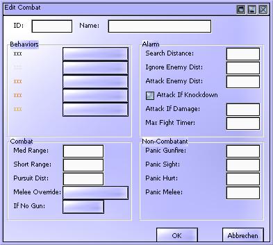
I've changed in the last part of the dat file the name psui_oniUI to psui_oniUi. After that Oni reads the psui_g206 file. The result is this:
now:  before:
Ssg 14:59, 11 December 2007 (CET)
To 2:
- I'm not sure what you mean. Do you refer to the fact that some stuff in the iamges is overlapping? (If yes: Well, I never thought about that. I was too fixated on making the WMMDs visible, I guess.)
Short note: if there are still dialogs from tools.dat that you do not have screenshots for here you go: http://cid-639aa31296681bfe.skydrive.live.com/self.aspx/Oni/tools_wmdd.zip
Cool. Thank you. Did you managed it to "actiivate" the "Tools" files? Ssg 01:19, 12 December 2007 (CET)
If by activate you mean loading tools.dat in Oni then no. (Though I converted tools.dat to PC format but Oni crashes if it finds it and I did not bother to check why). Those images were generated with my viewer.
Sorry for interrupting you guys a bit.
I saw the new WMMDs.. Are you going to upgrade OniSplit or OUP like Bungie's original editor tool? That would be cool. How far are you done?
By a side note: on "dialog_character_properties.png" you can see three different shields. So, maybe the (red one) "boss shield" was editable?
- Paradox-01 17:53, 12 December 2007 (CET)
Sorry?
- the navigation has to stay centered; have you never heard about interface design?
- ssg
- I guess I'm supposed to comment on that, but I wouldn't want to be disrespectful ;)
- ...
- Just do your stuff, and I'll do mine. I'll try to give you my reasons in the future.
- Please don't invoke "general rules" of "interface design". They are irrelevant here.
- Maybe the wiki's main navigation and other toolbars are centered? No they're not.
- In this case, the TOC takes up a lot of vertical space, and so does the header.
- Flushing the header to the right places it alongside the TOC and saves space.
- This was an experimental response to a concern by Neo. The current idea is to:
- make those big headers (with full-featured navigation) into footers
- use something much lighter at the top of the page (one or two lines)
- Hope you're OK with that. Please don't lose your temper with anyone.
- geyser 14:44, 25 September 2007 (CEST)
- "They are irrelevant here." Are you kiddin'?
- "Maybe the wiki's main navigation and other toolbars are centered? No they're not."
- Gosh, geyser, that's not the point.
- Yeah, they're not centered, they're on the left. But they're always there. That's the point.
- Have you ever tried to use a navigation that always jumps from one place to another? Such a navigation is just useless.
- I don't mind where the navigation is placed as long as they're all in the same place.
- Ssg 16:07, 25 September 2007 (CEST)
- Point taken. Be careful not to flame anything or anyone: it's all work-in-progress.
- Neo objected to having to scroll downwards to see actual page content, so I reacted.
- Actually, I did design the header with two alignments in mind: right and center.
- I prefer a right-aligned header most of the time, but sometimes centered is OK.
- It don't see it as "jumping" from one place to another. Not if you take OBD as a user.
- However, one point about full-featured navigation is that it's completely useless.
- If people open an OBD page, usually they haven't come to look at the navigation...
- So I'll basically swap the header and footer and make the new header even lighter.