TestToo: Difference between revisions
(testing) |
m (link fix) |
||
| (9 intermediate revisions by 2 users not shown) | |||
| Line 1: | Line 1: | ||
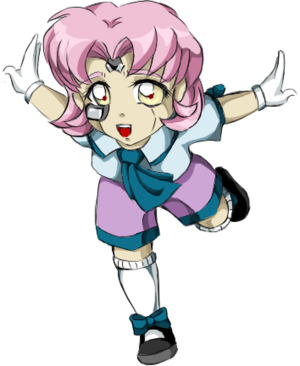
[[Image:Rina - Chibi Shinatama Final.png|thumb]] | |||
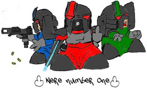
[[Image:Unknown Fan - We're Number One.png|thumb]] | |||
The chibi (Elite) [[Strikers]] (link) should appear as a banner above the text (because the image has landscape proportions). | |||
Shinatama should appear to the right of the text (because the image has landscape proportions). | |||
It looks like the popup-generating routine is auto-cropping the edges of the image, and keeps only the central region (with identical proportions). This is especially true for the portrait/thumbnail mode, and less noticeable for the banner mode (in which the width is apparently not cropped at all). | |||
By the way, TestToo is the name of this page, so we expect it to appear in '''bold'''. | |||
[[Category:Test pages]] | |||
Latest revision as of 03:18, 21 February 2022
The chibi (Elite) Strikers (link) should appear as a banner above the text (because the image has landscape proportions).
Shinatama should appear to the right of the text (because the image has landscape proportions).
It looks like the popup-generating routine is auto-cropping the edges of the image, and keeps only the central region (with identical proportions). This is especially true for the portrait/thumbnail mode, and less noticeable for the banner mode (in which the width is apparently not cropped at all).
By the way, TestToo is the name of this page, so we expect it to appear in bold.

