Talk:Main Page/Archive1
Diversification of Names
The list under Names includes varying entities. The Imago suggests splitting into: Characters, Groups, and Objects, allowing Added Value a separate listing. So proposes the Imago. Imago 04:31, 29 July 2008 (CEST)
- I liked your idea, and have implemented it with a couple changes: the Names page wasn't worth breaking up into even smaller pages for Characters, Groups, and Objects, and we wouldn't have multiple links on the Main page all going to one other page, so I simply changed the wording of the link on the Main page to be more descriptive.
- I did add a link to Added value, which indeed, should have been there all along. I'm just not sure what to do with the Trivia. Does that belong in Added value? I wonder what geyser's thoughts on that are. Was the Trivia page always going to be its own thing? Is "added value" supposed to refer only to further thoughts on Oni, which would rule out the Trivia page? Or should Trivia just be rolled into the other pages? I think at least some of it is totally redundant. --Iritscen 18:32, 29 July 2008 (CEST)
Standerds
- Mayhap we should set some standerds for article creation/modification. For one, NO m-rated language.The Deadly Brain 19:18, 25 May 2007 (CEST)
- I beg to disagree. Clean language is not an option.
- The best we can do is blank out certain characters.
- So I hope you're all right with s##t and f##k etc.
- Peace
- geyser 22:16, 25 May 2007 (CEST)
- In any case, such a rule would have to be motivated.
- Are you offended, or do you want to protect others?
- geyser 22:16, 25 May 2007 (CEST)
- BTW, there are standards in terms of spelling ^^
- geyser 22:16, 25 May 2007 (CEST)
- I know for a fact children younger then ten visit this site.
- The Deadly Brain 23:22, 25 May 2007 (CEST)
- Do you mean from Oni Central Forum? (we're not indexed on Google yet)
- All clear. But it's as I said. "Bleeping" at most.
- You can be the bleeper-in-chief if you want ^^
- geyser 00:59, 26 May 2007 (CEST)
Expansion
it could use a bit of enlarging... and detailing... this site ain't a direct-copy of the game (even though it might seem so ;P), so... :) EgonFreeman 1:33, 9 Jun 2006 (CEST)
- Well, feel free to contribute... that's how it works. All the detailing and enlarging is done by me ATM, but it's not supposed to stay that way...
- I know there are things like chapter summaries and character profiles missing, but... there are other priorities, including Oni-related ones :)
- I may be trimming the Main Page soon (it's a bit confusing at the moment). More images, less text. Links to namespaces and such.
- geyser 02:30, 14 Jun 2006 (CEST)
Proposal for New Main Page (User:Iritscen/MainPageProposal)
- Sorry, geyser, I should have discussed it first, but I thought, it's better to show than to tell, and if you didn't like it, you could revert... also, I copied because I didn't want to make you move things back if you wanted to revert (and because some things were getting moved to separate pages, not just moved together)...
- anyway, it sounds like you prefer the main items to be the only items on the front page, and each links to its own page, right? "Making of", "Basic", etc. are the only level that shows here. Is that right?
- Iritscen 17:27, 16 January 2008 (CET)
- You could totally have "shown" here in the talk page, or (better) in your user namespace, with only a link to that new page design here, like: User:Iritscen/Main Page
- That's right. The main page should be a "portal to portals" with most of the details moved to those other portals. What we have now is something resembling a "site map".
- We'll see about reverting. The wiki is important, but I will sorta have to focus on modding this week, so I'm not sure I'll have the right inspiration to help you guys.
- As for the splitting stuff off to separate pages, please let's not have too much of that. Mini-pages actually make the wiki harder to browse and more annoying to read.
- geyser 17:40, 16 January 2008 (CET)
Okay, what if the main page looks as it does now (but maybe a nicer arrangement of the titles), and then each of those links to some fairly large pages -- no mini-pages. If you don't like that, I will revert to original Main Page and go do something with the Images section... future changes will indeed be previewed in my namespace. Sorry, I forgot my wiki etiquette. --Iritscen 17:47, 16 January 2008 (CET)
@Iritscen: That sucks. Would you please change that back and use a playground first as geyser had suggested it above? Ssg 18:21, 16 January 2008 (CET)
- Well, since you asked nicely, sure, I'll do that. --Iritscen 18:22, 16 January 2008 (CET)
Thank you. (Wow, now that was really a fast response. :-) I've nothing against a new main page, but it's not a good choice to replace a full working site with an "under construction" one. Ssg 18:38, 16 January 2008 (CET)
- You're right, I was expecting a quick reply from geyser, but it seems he's moved on to something else. When he responded I was going to start fixing things up. You just happened to come along in the meantime. As he's pointed out, I should be doing things like that in my namespace; see User:Iritscen/MainPageProposal from now on.
- Anyway, we should still get a sense of what kind of page people want. A very simple one with groups like "Making Of", "Basic Info", etc., or can we have subgroups like in the Proposal? --Iritscen 18:55, 16 January 2008 (CET)
Oh... I'm sorry. Didn't know that it was already in work. However, your new main page looks good. IMO you can replace the main page.
One suggestion: Add an equals sign to every group and subgroup. F.e.: =Help= to ==Help==. IMO it looks better, because the page has not so much dividing lines. Ssg 11:20, 17 January 2008 (CET)
- Okay, I did that, and agree it looks better. But Ssg, geyser does not agree that the page should be so long, which is why I want to arrive at a consensus before replacing what's on the Main Page. I think the page can be that long, but maybe he thinks it's unwieldy or intimidating.
- Also, I am trying to add this code at the top of the page:
- <center><div style="font-size=162%;">Welcome to OniGalore, the wiki for all things Oni.</div> :[[Special:Statistics|{{NUMBEROFARTICLES}}]] articles in total</center>
- Two problems: 1. It does not change the font-size! and 2. The article count looks wrong. Look at the statistics page. There's a bajillion pages and it says only 90 are probably "real content". Is that true? --Iritscen 16:14, 17 January 2008 (CET)
Replace the equals sign between "font-size" and "162%" with a colon:
- 909 articles in total
The "90 articles" is right, I guess. IMO Wiki takes a namepsace as one article. So f.e. the whole OBD sites are only one article. Well, that's what I think. I've no idea, if that's right or not.
I like the long main page, because it contains all information I need. I don't have to search for something and I don't have to guess where something could be located. Nevertheless, to shorten it I would move the external links to a seperate site, because that's a topic that can run up to a lot of entries. The link to the "External Links" can be placed in the "Further Content" section. Ssg 18:57, 17 January 2008 (CET)
- THANK YOU. That was driving me crazy; I think our wiki's syntax is a little different from Wikipedia, or else I'm just confused. But the tags work now, and that's what matters. I agree with your input on the External Links (it's not really appropriate to have external links on a wiki's front page, now that I think about it), and am adjusting accordingly. --Iritscen 19:45, 17 January 2008 (CET)
- It is probably because wikipedia is updated :P...OniWiki is ollllddd Gumby
Vote for New Main Page
Please add your opinion below. All in favor of the page at User:Iritscen/MainPageProposal write For and optionally give a comment. Otherwise write Against and please explain why. Remember to sign! We need to get this matter settled so I can move on to other things on the wiki and stop glancing at the talk page looking for changes.
For. But I am a biased party :-3 --Iritscen 16:15, 28 January 2008 (CET)
For. The new page is hawt Gumby 08:42, 30 January 2008 (CET)
For. I like it :) Tyr 16:57, 30 January 2008 (CET)
Err. How is it different from the old one? geyser 16:26, 31 January 2008 (CET)
- Stuff got moved around, and a new intro, methinks
- http://wiki.oni2.net/w/index.php?title=User%3AIritscen%2FMainPageProposal&diff=7480&oldid=7479 if it helps :P Gumby 20:03, 1 February 2008 (CET)
For. Maybe we should move the "help" section to the 2nd or 4th position, so that the "basic content" is followed directly by the "further content". That makes more sense, IMO. Ssg 14:37, 2 February 2008 (CET)
- Kkk.
- K guys, looks like long silences attract spam. What do you think about a 3-column layout such as THIS?
- Of course, you could add items to every list, but I'd rather keep them short and redirecting elsewhere.
- If I don't have a reply by the end of the weekend, I'll make this the new main page, fa fa fa fa fa! ^_^
- The old one (or maybe Iritscen's revisited version) will be moved to "Main Page/Site map" or something.
Mmh... not bad either. If we use this, you should add a "valign=top" so that the entries of the last row are always on top. Ssg 19:07, 2 February 2008 (CET)
- Hmm...
- Added the valign thing. Needless to say, you're welcome to fancify the colors, reshuffle the lists etc... at any time.
- That page also relies on 4 pages that don't exist yet: "ONi", "ONi for fans", "ONi for players" and "ONi for modders"...
- geyser 00:32, 3 February 2008 (CET)
- Oh...
- Oh indeed. As for that spam we're getting, it's not clear whom we owe this new source of comfort.
- We were never indexed on Google, so it must be a problem of linking here from one place too many.
- Did someone add a link to the wiki from a site hosted on a public server, or something like that?
- Interestingly, the IPs are very specific, with a single set of spam per IP. That's a "good " thing.
- If we keep getting more of that, we will probably restrict editing access to registered users.
- geyser 00:32, 3 February 2008 (CET)
- OK, who do we know in Odessa, Ukraine? ^_^
I've added a lot of "Links". Ssg 01:08, 3 February 2008 (CET)
Why not to OniGalore:Community_Portal? geyser 01:44, 3 February 2008 (CET)
Oh... forgot about this site. (There is no link to it on the main page.) Sorry. Nonetheless, I prefer the name "links". So I would suggest to close the "community_portal" page and use the "links" page.
- To your main page proposal: Why are the entries of the 1st and 2nd rows links? ("ONi", "ONi for fans", "ONi for players" and "ONi for modders") Do we need these? What's your idea for the content of these?
- To the colouring offer: Believe it or not, but the colour you've chosen looks good to me. :-) Ssg 15:02, 3 February 2008 (CET)
- Crap.
- It's getting flooded in here. Will definitely clean this up after setting up the new Main Page layout.
- There are nice links to "Community portal" and "Current events" in the wiki's main navigation box...
- These pages are there by default, which is why I'm using them rather than pages called "Links" etc.
- So, closing OniGalore:Community_Portal is not an option, but we can make "Links" redirect there.
- I strongly object to an "exhaustive" collection of links (the "links to programs", for example)...
- Such lists are useless to newcomers, and only serve as bookmarks to people who know where to look.
- If a program is worth linking to, develop on it, either on its own page, or in "Programs" or such.
- "ONi" and the other three are supposed to be portals in article form (with sentences and lists).
- They would describe the main fields of interest and provide links to more detailed "articles".
- Simply put, they are expanded, verbose versions of the mini-lists in the Main Page portal.
- Heh, I'm just using Template:Table, so the color is yours. I thought of livening it up.
- (you know, with different colors for the columns, a background picture, some mini-thumbs)
- geyser 18:10, 3 February 2008 (CET)
- To a public server?
- Could be almost every fan site which isn't on oni2.net. (Links which I set to the wiki: a more or less dead webspace*, a private wiki*, a privat forum**). Or do you mean link from a public server? Maybe it works that way too. (I've a link on animexx.onlinewelten.com** to my oni2.net webspace which is linked to the OG.)
- * - not indexed by google
** - indexed by google, but restricted area excluded for logged in members - However, it seems like a silly bot which attacks only the "Talk:Main Page". So why not set it under protection?
- Paradox-01 14:46, 3 February 2008 (CET)
- Yes, I meant "from" (sorry about the "typo").
- I enabled protection for this page.
- You have to log in to edit it now.
- geyser 22:58, 3 February 2008 (CET)
- For/against...
- Well, I think both pages are better than the old. But I trend to geyser's because it's more compact.
- Paradox-01 14:46, 3 February 2008 (CET)
Vote Canceled
- At the risk of sounding bitchy... you guys really got off track here. You're talking about spam (where?), and portals, and forgetting to sign so I have no idea who's saying what. Now geyser has introduced a new main page in the middle of the vote, so the vote has been totally derailed. This means everyone's vote is now obsolete, because it may or may not have been made after seeing geyser's new page. *sigh* If we're going to try this democratic thing properly, we need everyone to please vote again in the next section. It's not my fault. --Iritscen 18:44, 4 February 2008 (CET)
- I'm sorry I spoiled your vote (perhaps intentionally: I'm a dictator after all, albeit an enlightened one). Note, however, that every single person either signed or logged in.
- You could thus always get an idea of who's talking, with a quick look at the history. BTW, the recent spam would also appear there, as it was plaguing this very page.
- You shouldn't overestimate the democratic aspects of wikis. Just because Wikipedia does things a certain way doesn't mean we should mimic them: not at all...
- All those encyclopedic standards, for example, are completely irrelevant to a project wiki, which should just be decently informative to its supposed visitors, period.
- I also think it's quite appropriate not to enforce scholarly objectivity in the articles. As long as "personal essays" and occasional wacky stuff do their job, let them be.
- Bring in organization if you like, but spare us the tedious bits. In other words: take the "fun" out of "functionality", and I might buy myself some extra guts, my friend ^_^
- geyser 23:09, 4 February 2008 (CET)
- Perhaps you noticed my bringing in a template, huh? :-) Don't worry, I am not going to be a wiki-Nazi who insists on WP-style writing everywhere. I am all for some whimsicality in this wiki. But at the start, it seems to me that the wiki was basically your baby, and while I don't want to take it away from you (not that I could, Mr. Admin!), if we don't open it up for others to contribute, it can't represent the community as a whole. But if an article is written in 1st person, then it naturally makes anyone else hesitant to touch it, so they can't contribute. That was the purpose behind the template.
- I'm sure you won't mind others taking some of the burden off your shoulders and helping you finish up the wiki; I just want to assure you that that's really my only goal in everything I do here. I also don't intend to put every single thing up to a vote; it's just that the Main Page is an important matter and I think we need input on what design would be most user-friendly. --Iritscen 15:28, 5 February 2008 (CET)
- geyser 23:09, 4 February 2008 (CET)
2nd Vote For New Main Page
Please vote for the old (current) Main_Page, or for my proposal, or for geyser's proposal. I guess it will save time to just say OP for the original (current) page, IP for Iritscen's Page, or GP for Geyser's Page. --Iritscen 18:44, 4 February 2008 (CET)
- IP.
- I do appreciate geyser's new page, but I think the formatting is not really proper wiki-style. True, it's our wiki and it can look however we want it to. I just prefer a vertical layout to a horizontal layout. Also, the comments on each item in GP are a bit untidy and make it look cluttered because they broaden the overall table.
- Iritscen 18:44, 4 February 2008 (CET)
- GP.
- (I don't think either Iritscen or I are in a position to vote, but his critique deserves a response)
- No comment on your preferences, but IMO a home page should offer an overview within a page or two.
- Optimally, the user doesn't need to scroll at all to start navigating (more or less my suggestion).
- As for "proper wiki-style", you should have a 2nd look at Main Pages elsewhere... anywhere.
- They are typically very small: either tight paragraphs or tables, directing to only a few pages.
- Finally, my table spans the whole page: the comments wrap around instead of "broadening it up".
- Also note that the comments don't wrap at all unless your horizontal resolution is 800 or lower.
- I wouldn't say the table looks cluttered on a 1024x768 monitor, which is quite something.
- If by "untidy" you meant the wacky randomness of some comments, it's an intended feature.
- Of course I can't claim to be a master of silly jokes à la Bungie (nor do I want to).
- But the wiki can be made more appealing/intriguing if it's spiced up by such things.
- geyser 23:26, 4 February 2008 (CET)
- I'm not going to keep critiquing your page and start sounding like a politician doing attack ads; the vote isn't up to us, anyway; but just to be clear, you are right that your table is wiki-like. But the advantage of my vertical approach is that the Table of Contents is used to jump to wherever you want. You also don't have to categorize yourself first when trying to find a link ("Am I a fan, a player, or a modder?"). You just look for the subject you want to read about in the TOC and click it.
- And it's okay to be a little silly, but the comments in parentheses are basically explaining what each link is, which looks like clutter to me. If the links are not explanatory enough for a newbie, than you and I are doing something wrong and the links/pages need to be named better. --Iritscen 15:42, 5 February 2008 (CET)
- ?P.
- Ooh... I can't decide. Both are good. Seems that we have to wait for some more opinions...
- Ssg 12:34, 5 February 2008 (CET)
Vote Canceled
Okay, let's forget this whole thing ever happened. --Iritscen 19:30, 6 February 2008 (CET)
Beyond the vote
- @geyser: The table doesn't look good in 1440x900. I suggest either to put the table into another table or to put the content of the last row into separate tables and center these. Also I don't like the look of the part above the table (introduction, welcome pic). That should be polished somehow.
- Ssg 12:34, 5 February 2008 (CET)
- As for both layouts being good, my suggestion was to keep them both. Iritscen's can go either below the table or on a separate page (like a site map).
- As for the looks in 1440x900, I'm not sure what you mean. If you object to the lists being flushed left in wide table columns, then I kinda disagree.
- If you embed the lists into centered sub-tables, the width of those will depend on the content, so it will be different for the three columns. Ugly.
- IMO, left-aligned lists are OK and anything else will look worse. Might be wrong. Anyway, you are free to polish anything you feel like polishing.
- geyser 14:39, 5 February 2008 (CET)
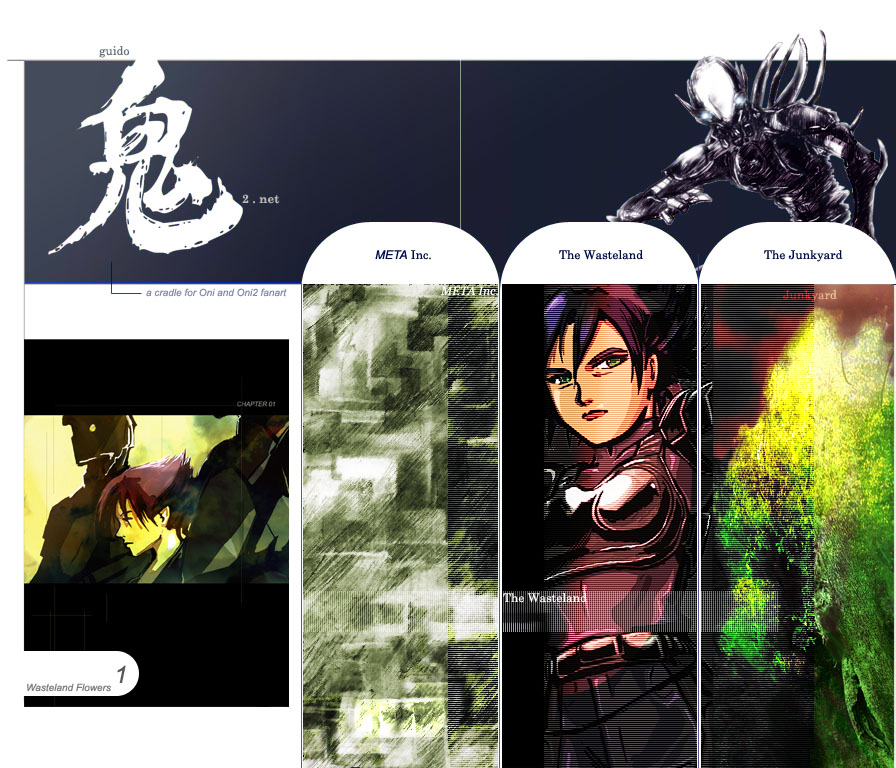
My vote goes neither to Geyser's nor to Iritscen's proposal. What we have here is not a choice between two alternatives. We rather need a blending of both. Iritscen organized the main topics way better than Geyser. However Geyser's layout is absolutely more user friendly... even a lazy person like me is allowed to spot everything that's worth of interest at a first glance. Somebody just grab Geyser's layout script, and figure out a way to put in the bottom table all the topics as Iriscen said. Also, Iritscen you may think of a better welcome message for the page header. The note about the search function is annoyingly obvious, just delete it. And remove that bloody drawing of mine! Bring back Lorraine's art or just leave no pictures, it will look fine as well.
- guido 13.15, 6 February 2008 (CET)
- What do you mean by the "bottom table"? I'm curious.
- "A better welcome message"... yeah, I ripped that thing off wholesale from Wikipedia, I'm not defending it. I'll see if I can think of something better.
- "The note about the search function"... yeah, it's a little patronizing, I thought the same thing.
- "Remove that bloody drawing of mine"... I really like it, but perhaps a piece of "canon" art is called for on the Main Page. I'll browse through our Images gallery for something of Lorraine's.
- Iritscen 15:21, 6 February 2008 (CET)
- Guido and ssg both have really weird ways to refer to those three lists: "bottom table", "last row"... for sake's sake, it's the actual table, guys!
- Welcome messages are hard to get right, which is why no one seems willing to take the responsibility of actually sitting down and writing them. ^_^
- I know for a fact that many people are unaware/oblivious of the direct-hit a.k.a. "Go" feature. I explained that in some more detail. Enjoy.
- Guido, your drawing is staying. It's up to you to remove or replace it, but as far as I'm concerned I'd only take the thumb-frame away.
- Apart from being just plain nice, it makes us stand apart from all those who don't know better than to recycle Lorraine's art forever.
- BTW, the opportunity to liven up the wiki with contextual illustrations still holds. Help yourself to the image gallery, everybody.
- geyser 18:18, 6 February 2008 (CET)
- About the comments in brackets. When they are humorous rather than informative, and don't contain hyperlinks, we can replace them with hoverboxes, like this: Iron Demon
- There are plenty of other ways to improve "my" table, but I woundn't cram all of Iritscen's "site map" into it because: 1) it will never encompass the variety of the wiki's content; 2) in the attempt to do so, it will grow larger and larger, so that "even a lazy person like [Guido] is able to spot everything that's worth of interest at a first glance" will no longer be true.
- geyser 18:18, 6 February 2008 (CET)
- Okay, I will implement the hover boxes. That seems like a good compromise. --Iritscen 19:11, 6 February 2008 (CET)
- Hoverboxes added. I also removed some lower levels of hierarchy (or should I say arboresence?) in the Main Page because that kind of detail is unnecessary (that's what my Main Page, er, Site Map is for!) --Iritscen 19:32, 6 February 2008 (CET)
On The New Main Page
Well, this is it. We've just witnessed a mental breakdown. Someone call the men in white coats for geyser. --Iritscen 17:43, 6 February 2008 (CET)
- Also, am I the only one who has a big problem with "ONi"? I suppose if I weren't lazy I would change it to "Oni" myself and get in a revert war with geyser, but instead I'm being diplomatic by asking for other people's opinions. --Iritscen 18:27, 6 February 2008 (CET)
- And so it begins...luckily for me, I won't have access to the forum for a few days. geyser, I apologize, but I am hardheaded :PGumby 20:02, 6 February 2008 (CET)
That chibi Shinatama is cute. Just wanted to say that. --Iritscen 17:14, 12 February 2008 (CET)
Okay, here's a more constructive comment. I propose that we (by which I mean geyser, since he's the expert in tables) make a second table below "Oni" for "After Oni..." where we can put the items in See Also. It seems disorganized to have a little section like that after a big table. The second table could bring those items out in more detail (specifically, breaking out "Oni 2" to be a little more specific). Just an idea. --Iritscen 17:25, 12 February 2008 (CET)
- Well, as far as I'm concerned, the Main Page is functional enough as it is
- (however, I still can't forgive how you replaced Upgrades with Daodan DLL).
- If you think about "Oni 2" in terms of "added value", it is not "after" Oni.
- And the projects under "See also" are really miscellaneous curiosities ATM.
- When Konoko Payne goes beyond the proof-of-concept stage, I'll reconsider.
- geyser 23:00, 25 February 2008 (CET)
Chibi Image
Why is it all pink when I see it on the main page, but all colorful when I click on the image?
- --Gumby
- Me too. Gumby, what browser you're using. I've mozilla firefox.
- Same effect for an image by Iritscen. Please check THIS and confirm the error.
- --Paradox-01 21:15, 25 February 2008 (CET)
Being colorblind, it's hard for me to see that Shinatama is "all pink" on the main page, but she doesn't look nearly as good as on the image page:  .
.
Even aside from the color thing, she might need to be sized down in a proper graphics app like Photoshop rather than leaving the scaling to the wiki. --Iritscen 21:38, 25 February 2008 (CET)
- Perfect, Gumby! Nicely fixed. --Iritscen 21:40, 25 February 2008 (CET)
- It is not a perfect fix, it's a dirty hack around a flaw in the outdated MediaWiki engine.
- I asked Alloc to update the engine and I'd rather if you had some patience until he does so.
- Sigh. I'll leave the resized PNG for now, but eventually I'll revert to the one I uploaded.
- Wikipedia scales PNG nicely, so there's no reason why our wiki shouldn't. Just be patient.
- geyser 23:00, 25 February 2008 (CET)
- "dirty hack"? Pshaw, that took a lot of work...like...copying the image...and uploading the image :P I understand the want for the PNG to work properly though. I once asked Alloc about the wiki's age and there was some reason he didn't want to upgrade it...probably too much work...xD. I wanted to have support for lowercase titles, but the wiki is too old :P. And, I use IE7 at school. Let me check using Opera (Wii browser) for the glitch...
- I have Opera, and the glitch is there. Moreover, you have to realize that the scaling glitch is server-side.
- It's the wiki's engine that generates the scaled versions of the images, when processing wiki text into HTML.
- It's those automatically generated images that are wrong, and they'll be wrong no matter what the browser...
- Upgrading the wiki means quite a lot of work for the admin, and a downtime, too. Dunno when that'll happen.
- geyser 06:06, 27 February 2008 (CET)
- Yeah, I know, it doesn't hurt to check though...:D
Talking Heads Xplode
- The wiki now scales PNG properly, however previously generated thumbs may need to be purged (the easiest way is to reupload the image).
- geyser 12:45, 2 June 2008 (CEST)
- Now that the PNG scaling problem is fixed we can re-upload all of the talking head images as PNG right? The JPEG artifacts look really bad, especially when scaled. I'd be glad to help.
- rossy 11:46, 3 June 2008 (CEST)
- Great. Let us know if you have problems exporting them from Oni. As for the naming convention, please use Image:TXMPSHINlistening.png etc. It's also best to add the category tags [[Category:Portraits]][[Category:In-game art]] to the upload summary. After you're done, we'll delete "Images/In-Game/Talking_Heads".
- Maybe "Portraits" (or "Small portraits") is not the best pick, but "Talking heads" is pretty bad as well. Oni calls them "cinematics", even more counter-intuitively. They're "insets" and "popups" (or "fly-ins") to me, so maybe the least confusing category would be something like "Cutscene pop-ups" or "Inset portraits".
- If we don't want to stress the function of those images in Oni, then "Small portraits" is probably good enough. If we want to stress that they're backing up the voice-overs, maybe I'd use "Voice-over art" (deliberately confusing, sorta).
- Off topic: I didn't bother to give you feedback on your user page, since you apparently got in touch with SFeLi. As for Daodan discussion, you've probably spotted Daodan DLL by now.
- geyser 14:31, 3 June 2008 (CEST)
Welcome statements
- I removed this from the top of the Main Page because I thought it was redundant, feel free to reinject it in the main text somehow.
- Whatever you do, make sure that Shinatama doesn't interfere with the table on 1600x#### or wider. Move the haiku around if you have to.
- geyser 12:45, 2 June 2008 (CEST)
Main Page Image
Does anyone know how to randomize in the wiki parser language? Or else how to get the current date? I'd like to switch up the image on the right of the Main Page from time to time. It's very nice, but it's also very very cute, and Oni is not accurately summed up by Chibi Shinatama. We should at least put in a darker image from time to time, and vary the subject (Mukade, Konoko, Griffin, etc.). But I don't want to have to change the image manually. If we can set up a template that looks at, say, the day of the week, or picks a random number, we can have the image change itself from a pool of candidate images that we would set up. --Iritscen 18:09, 1 August 2008 (CEST)
- 1) Let's have a look at the pool, first; 2) It's less procrastinatory to do it manually, really; 3) Actually, pretty much anything is less procrastinatory than this ^_^ --geyser 18:19, 1 August 2008 (CEST)
- 1. I don't have a pool, I just had a thought and then posted it. But the pool would be mostly Guido stuff, certainly. Not fan art in general. No more than seven handpicked images, cream of the crop and all that.
- 2. Yes and no. Who feels like changing the page every week or whatever? I don't. Plus that generates unnecessary edits. I love automation, and getting technology to work for me, not the other way around.
- 3. We can afford to procrastinate this, it's hardly a big issue. Seriously, I just wanted to throw my thoughts out there, and see if anyone had an answer to my question(s) (I've done some research, but I haven't found anything). We'll get around to doing something when we get around to doing it. No rush (unlike the other umpteen things I am working on). --Iritscen 18:27, 1 August 2008 (CEST)
- I see no image, and the haiku is smashed to the right, in a thin column. Making it only a simple poem :) Gumby 04:13, 3 August 2008 (CEST)
- Which image is up? Griffin's? It looks fine for me. Can you take a screenshot of the problem, please? --Iritscen 13:50, 3 August 2008 (CEST)
- "Gumby: I see no image - Iritscen: Which image is up?" Duuuuuuuh, priceless.
- "Griffin's?" Griffin's was yesterday. Today's treat is ominous ragged Konoko.
- "It looks fine for me." Blame your browser's cache for showing you Griffin.
- geyser 16:02, 3 August 2008 (CEST)
- Well, bite me. I hit Refresh on the page and it still showed me Griffin. That seemed wrong, hence my question to Gumby as to who he was seeing. And now I Refreshed again and see scary smiling Konoko, but the haiku is still fine. Since I didn't change the layout of the page at all, only varied the image, I am justifiably confused about what problem Gumby could be having as long as he's not looking at my MainPageTest. --Iritscen 17:48, 3 August 2008 (CEST)
- Okay, looks like you did do something to fix it, I guess. I never saw the problem, so I don't know. But thanks, I suppose. God, you piss me off so much sometimes, though, geyser. --Iritscen 17:51, 3 August 2008 (CEST)
- hence my question to Gumby as to who he was seeing he said "I see no image", re:duh... That seemed wrong... but you sounded like everything was "fine for you". looks like you did do something to fix it... yeah, turned out the fancy variable is zero-based. --geyser 18:09, 3 August 2008 (CEST)
- reasons I'm an idiot... Damn. I need more sleep. --Iritscen 20:26, 3 August 2008 (CEST)
- hence my question to Gumby as to who he was seeing he said "I see no image", re:duh... That seemed wrong... but you sounded like everything was "fine for you". looks like you did do something to fix it... yeah, turned out the fancy variable is zero-based. --geyser 18:09, 3 August 2008 (CEST)
- geyser 16:02, 3 August 2008 (CEST)
- Which image is up? Griffin's? It looks fine for me. Can you take a screenshot of the problem, please? --Iritscen 13:50, 3 August 2008 (CEST)
- I see no image, and the haiku is smashed to the right, in a thin column. Making it only a simple poem :) Gumby 04:13, 3 August 2008 (CEST)
On The New New Main Page
Well, I don't understand why it has to be fiddled with. I strongly feel that two large blocks of tabled text such as we have now, preceded by technical mumbo-jumbo, are not more "inviting" than the light, airy feel we had with the previous introduction text. I thought we had finally reached a Good Place with the Main Page when I slimmed down your unnecessary explanations. --Iritscen 04:04, 8 October 2008 (CEST)
- I plead guilty on the mumbo-jumbo: I thought of it as intriguing. It's a reference to Chung's datapad, the icon of which (OniGalore's old icon) is shown in the upper-right corner, and leads people straight to CHAPTER 01 . TRIAL RUN. Somehow I've always wanted the main page to be somewhat fancy, with the welcome message set in some kind of atmosphere: in this case, Oni's cyberpunk in general and data terminals in particular. Maybe a screenshot of Konoko reading our welcome message from Chung's datapad would be more immersive. Or maybe it would suck.
- As for my unnecessary explanations, I hoped they would encourage scripters from OCF to contribute to BSL documentation. If we think this isn't going to happen, then you can remove the whole NOTE ON THE "GO" FEATURE block (to the general public it may look like an insult to intelligence, yes). Keep the table, though, as it solves the overlap issue permanently; if you want airiness, you can have something like this (note I trimmed the first block significantly).
- geyser 05:16, 8 October 2008 (CEST)
|
|

.png)
| TABLE |
|---|
It's quite helpful when you explain your thought processes like this, it allows me to find common ground. For instance, I think the idea of an "atmosphere" for the Main Page is an interesting one. I kind of feel like we could only achieve that with something more radically graphical and more unified. In other words, if this is ugly, which I think we all agree on:
ENCRYPT SEQUENCE TmeC119-67
Manifest 12A-694-v contains a number of fragile items. Note the follo....
<TCTF UNIVERSAL DECRYPT RUNNING...DATA FOUND. DISPLAYING...>
Then this is less ugly, but still not pretty, and it's also distracting:
ENCRYPT SEQUENCE TmeC119-67
Manifest 12A-694-v contains a number of fragile items. Note the follo....
<TCTF UNIVERSAL DECRYPT RUNNING...DATA FOUND. DISPLAYING...>
This is more immersive:
(I deleted this one day because it was ugly. --Iritscen 23:01, 17 July 2010 (UTC))
So, in other words, making some of the text into graphics allows us the freedom to use different fonts and more complex table-like structures (for instance, making the whole page feel like a datapad display; the above image doesn't really convey that, of course, it's just a quick and dirty sample). An overall structure would encompass the welcome text, the navigation table, and the picture of the day, all into one. Right now another problem on the Main Page is that there are two boxes and then a picture which feels tacked on to one side.
So maybe we can try out some different designs and post mock-ups here of our ideas.
As far as the Go/Search note, I just don't feel that the Main Page is a place to solicit editors to perform a certain task like setting up BSL redirects, even if they do kick butt. The thing is, I already tried to draw some people over to the wiki by posting on the forum a while back, and ultimately, even if it had a small effect, it wasn't much. I don't think we're ever going to see mass participation by community members in the wiki; it will probably always be more or less the ones who are already active (plus a few more if the community grows as we hopefully get more attention). And since you acknowledge that to readers of the wiki it is condscending to explain what "Go" and "Search" mean, I think we know what has to happen to that blurb.
P.S.: How did you trim the first block that is posted above? It's identical to what's on the current Main Page.... --Iritscen 16:20, 8 October 2008 (CEST)
- "Making the whole page feel like a datapad display" is what I suggested up there. Text doesn't have to be photoshopped, because bold Arial or Tahoma already looks OK, and there are some more common font families we can use; so there can be graphics in the background, with typeset text on top of it. However, I don't feel we should spend too much time on designing something as fancy as this or whatever could have been the new design of OniCentral. I actually planned a compact, datapad-like design for geyser.oni2.net at first, based on THIS but with a black/blue theme similar to Oni's Load Game dialog. And I could port it here. But I doubt we can make such an "atmospheric" thing work well within an otherwise plain frame (the default layout of the wiki is black on white and it's not going anywhere). Screen width VS resolution of the immersive screenshot or artwork would be one issue, visual clash between the "welcome" and the table would be another, and with the picture of the day next to a graphically enhanced text, people won't know where to look first and what to look for, sorta. So probably it's better to stick with my "airy" suggestion up there. A minimal block of text, and the haiku/POTD as the only artful/atmospheric element. As for the block of text, it's the same as on the current Main Page, yes, but it's shorter and more tidy than the previous revision. --geyser 17:13, 8 October 2008 (CEST)
- Just to be clear, I was suggesting a look that would include the table at the bottom as well as the picture, in other words not looking strictly like the in-game datapad, but based on the look of Oni's interface and technology.
- But as you said, it wouldn't jive with the overall plain "theme" of the Main Page, and in any case, it could be considered jarring to go from a fancy page like that to plain black on white everywhere else on the wiki. So I'm willing to let this idea go.
- P.S.: Still meaning to write individual haiku for the PotDs, just haven't been in the poetic mood yet. --Iritscen 20:17, 8 October 2008 (CEST)
Cherry picking
- P.S: ... and what about replacing "serendipity" with "cherry picking"? I think it would be more intuitive. [User:Guido|Guido]] 10:00, 26 October 2008 (CEST)
- Well, the meaning of "cherry picking" was really not intuitive to me, so I had to look it up. And it's still not clear to me what exactly it means as applied to this wiki (biased sample? WTF?) or why it's more appropriate than "serendipity". Eventually I meant to replace this with a link to the OniGalore_talk:General_disclaimer, which would be a sort of condensed site map. --geyser 11:10, 26 October 2008 (CET)
- It's true that I don't think "cherry picking" is the right phrase to replace "serendipity", but the more important question is what "serendipity" is supposed to mean in the first place. You should be aware that, as fond as you are of "serendipity", geyser, I can confidently say that a lot of native English speakers do not know its meaning, and those who do, like myself, are still at a loss as to what it means when used here. When I first saw that the word was a link, I assumed it would link to Special:Random, not a dictionary definition of the word that still gives it no context....
- "a link to the OniGalore_talk:General_disclaimer" o.O ...Come again, geyser? --Iritscen 17:57, 26 October 2008 (CET)
- Well, the meaning of "cherry picking" was really not intuitive to me, so I had to look it up. And it's still not clear to me what exactly it means as applied to this wiki (biased sample? WTF?) or why it's more appropriate than "serendipity". Eventually I meant to replace this with a link to the OniGalore_talk:General_disclaimer, which would be a sort of condensed site map. --geyser 11:10, 26 October 2008 (CET)
- Clicking "Random page" has less to do with serendipity than following intrawiki links. The idea is that beyond a certain amount of cross-linking, the wiki virtually "navigates itself", and allows casual/curious readers to end up in unexpected places, through a set of more or less loose associations with what they were initially interested in. Maybe I'm the only one who reads wikis like this (starting with Wikipedia) and enjoys it... Anyway, "serendipity" in the context of our wiki (casual navigation powered by intralinks) is not meant to be self-explanatory right now. The actual thing that's supposed to be featured on the main page is the disclaimer: I used to link to it without the serendipity label, and I will re:link to it eventually, probably without calling it serendipity either. Thus thee serendipity thing is just a placeholder, or at least you can think of it that way. Of course, you can decide to kill that initiative (and delete the disclaimer while you're at it), but I wouldn't do that, or if I did, I'd expect unexpected retribution. My advice is to ignore everything you can ignore, and I'll do my best to ignore bureau-cats and other uncyclopedic spam that is only funny to certain people while on certain drugs --geyser 22:04, 26 October 2008 (CET)
- <sigh>Because the Disclaimers page is so much funnier to such a larger audience :rolleyes:. The fact that you use the words "uncyclopedic spam" simply blows my mind when you were just talking about this page in the same breath. Anyway, what I was trying to ask above was, How is the Disclaimers page in any way connected with your concept of browsing the wiki by serendipity? And don't get jumpy, I never said I was thinking of killing any initiative, I don't attack what I can't even begin to understand :-3. --Iritscen 01:39, 27 October 2008 (CET)
- Quite simply, a list of ill side effects is a nice place to start browsing; every ill side effect linking to an article, ideally. Seen that way, the disclaimer has the potential of becoming a condensed site map (and I already told you that). Not in the present form, of course (remember that I was young and stupid when I stole SOW's disclaimer, so comparing your own silliness with it is not to your advantage), but as outlined in the footer and on the talk page (which I also linked to, for Mukade's sake). My own brainstorming and Gumby's should give you an idea of what's cooking. Just don't tell me we have to explain the meaning of every single item, because we all have better things to do right now. --geyser 02:16, 27 October 2008 (CET)
- Okay, now I get it, at least as much as I'm going to get it, I suppose. But if you think this plan was in any way clear before your last post, hate to tell ya, but it wasn't; don't act like you explained anything on the Disclaimers talk page, it's an incomprehensible list of gibberish right now. Whatever, have fun with it.
- P.S.: By injecting humor into official wiki pages such as Policy, I am *trying* to preserve fun while adding functionality, sorry if you don't see it that way, but I daresay most people will; heck, even Wikipedia has joke pages as part of their system of policy articles. --Iritscen 02:28, 27 October 2008 (CET)
- The functionality added by those official pages is nil, and the humor is IMO fairly tasteless, so in a way it's "worse than nothing". You know as well as I do that there's more than enough places on the web that cultivate that kind of humor; no need to develop it here as if our wiki was Yet Another Weak Hu--Iritscen 04:27, 27 October 2008 (CET)mor Site. If you can relate your humor to Bungie or Oni, that will already be more creative, if not better (I mean, since Bungie humor is already not very tasteful, either make the weak s##t part of the Bungie strain or leave it out). That's just my opinion of course, you're a big boy and I wouldn't want to tell you how to run an Oni wiki. <-- NOT ASKING FOR A FORMAL POLICY, OF COURSE; JUST TRYING TO APPEAL TO COMMON SENSE: THE WIKI IS NEITHER A SELF-INDULGENT BLOG NOR A PORTAL TO UNCYCLOPEDIA; SO LET'S AT LEAST TRY TO KEEP THE CRAP OUT
- "don't act like you explained anything on the Disclaimers talk page, it's an incomprehensible list of gibberish right now" Let's not play dumb and dumber, please. Care to go and read it again? Here's what it says at the bottom: <-- OOPS! MISTAKING THE DISCLAIMER FOR THE TALK PAGE WAS A VERY BAD IDEA
- The above masterpiece was outrageousy stolen (by me, geyser) from Science of War and Oppression. I am looking forward to making a more Oni-oriented variant (you're welcome if you want to help), but for now it's SWO's original version, with a few original entries by myself. No, I don't have permission to redistribute their disclaimer. I'll try to keep it clean :)
- You have had the ample opportunity to check out SWO's original disclaimer (incomprehensible list of gibberish? riiiiiiight <-- OOPS! SAME MISTAKE AS ABOVE, LOOKING AT THE WRONG PAGE), as well as the talk related to ours, and the recent contributions by Gumby and myself have made the initiative all the more explicit. Sorry if you didn't get the picture, but I didn't want to insult your intelligence. <-- THAT ONE STILL HOLDS, I GUESS. I MEAN, GUMBY GOT THE IDEA ALL BY HIMSELF AND EVEN ADDED THE FIRST HYPERLINK...
- geyser 03:27, 27 October 2008 (CET)
- Non-Oni-related humor... is that what's been burning your biscuits all this time about my jokes? Sorry, I didn't think we had a Bungie-only humor rule here. Let's try not to be so insular and snobbish, 'kay? Let's also try not to be insulting, although it's too late for that today -- having an Editing Policy page, a Copyrights page, or any page defining user rights and roles is a hell of a lot more useful than your original Disclaimers page. And I certainly read that note at the bottom a while back... how on Earth do you think that wording conveys your plans to make a Site Map out of random Oni phrases on a Disclaimer page? The longer you continue this back-and-forth, the more ridiculous you look. --Iritscen 03:35, 27 October 2008 (CET)
- P.S.: In response to your point about not making the wiki a portal to other crap, I don't plan on doing regularly what I did with the Editing Policy page. But to clarify what I meant above in case you missed it, I don't think we need to be insular as a community, where anything that's not Oni or generally Bungie-related is automatically "crap". I specifically put a note in my Talk page about how a community can go too far in that direction and become a barricaded fortress of in-jokes that only the community elite actually understand. I prefer a more approachable take on humor, personally. But I will try to keep the external links to a bare minimum. --Iritscen 04:27, 27 October 2008 (CET)
- geyser 03:27, 27 October 2008 (CET)
- Quite simply, a list of ill side effects is a nice place to start browsing; every ill side effect linking to an article, ideally. Seen that way, the disclaimer has the potential of becoming a condensed site map (and I already told you that). Not in the present form, of course (remember that I was young and stupid when I stole SOW's disclaimer, so comparing your own silliness with it is not to your advantage), but as outlined in the footer and on the talk page (which I also linked to, for Mukade's sake). My own brainstorming and Gumby's should give you an idea of what's cooking. Just don't tell me we have to explain the meaning of every single item, because we all have better things to do right now. --geyser 02:16, 27 October 2008 (CET)
- <sigh>Because the Disclaimers page is so much funnier to such a larger audience :rolleyes:. The fact that you use the words "uncyclopedic spam" simply blows my mind when you were just talking about this page in the same breath. Anyway, what I was trying to ask above was, How is the Disclaimers page in any way connected with your concept of browsing the wiki by serendipity? And don't get jumpy, I never said I was thinking of killing any initiative, I don't attack what I can't even begin to understand :-3. --Iritscen 01:39, 27 October 2008 (CET)
- stop bitching or my ninjas will come and find you! guido 18:47, 27 October 2008 (CET)
- Guido, nice of you to watch over us, but don't let it become your only hobby. Also, you're always late, so your assassins probably suck at catching up with their targets, too ^_^ --geyser 21:09, 27 October 2008 (CET)
- stop bitching or my ninjas will come and find you! guido 18:47, 27 October 2008 (CET)